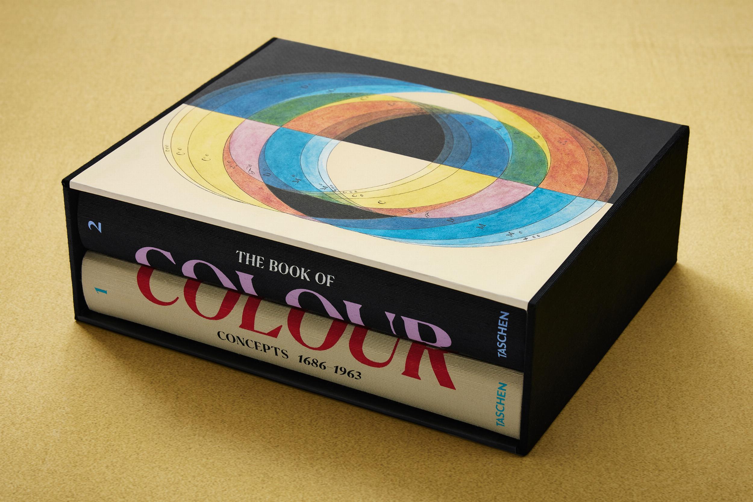
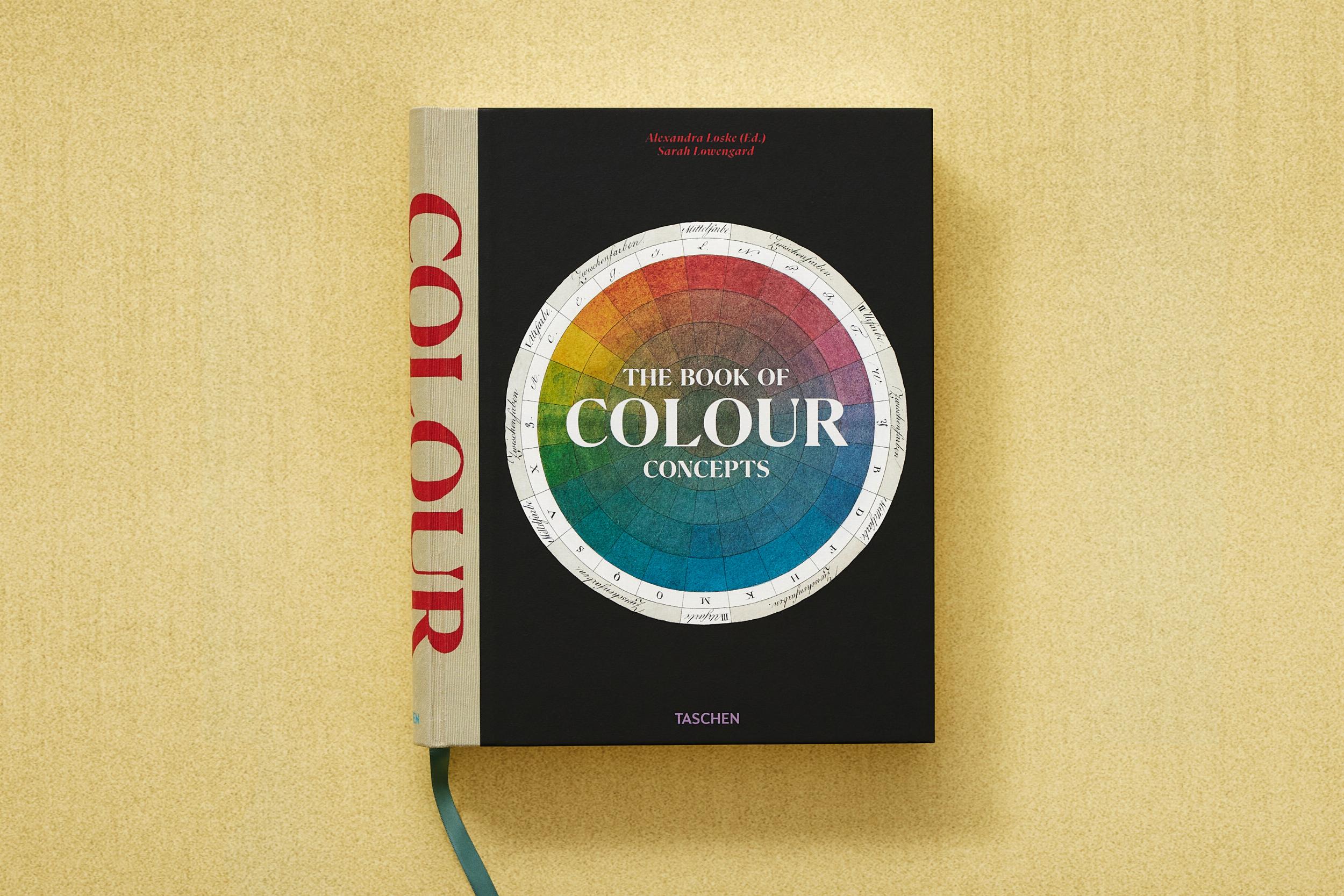


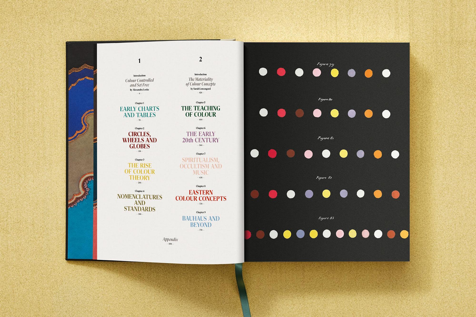
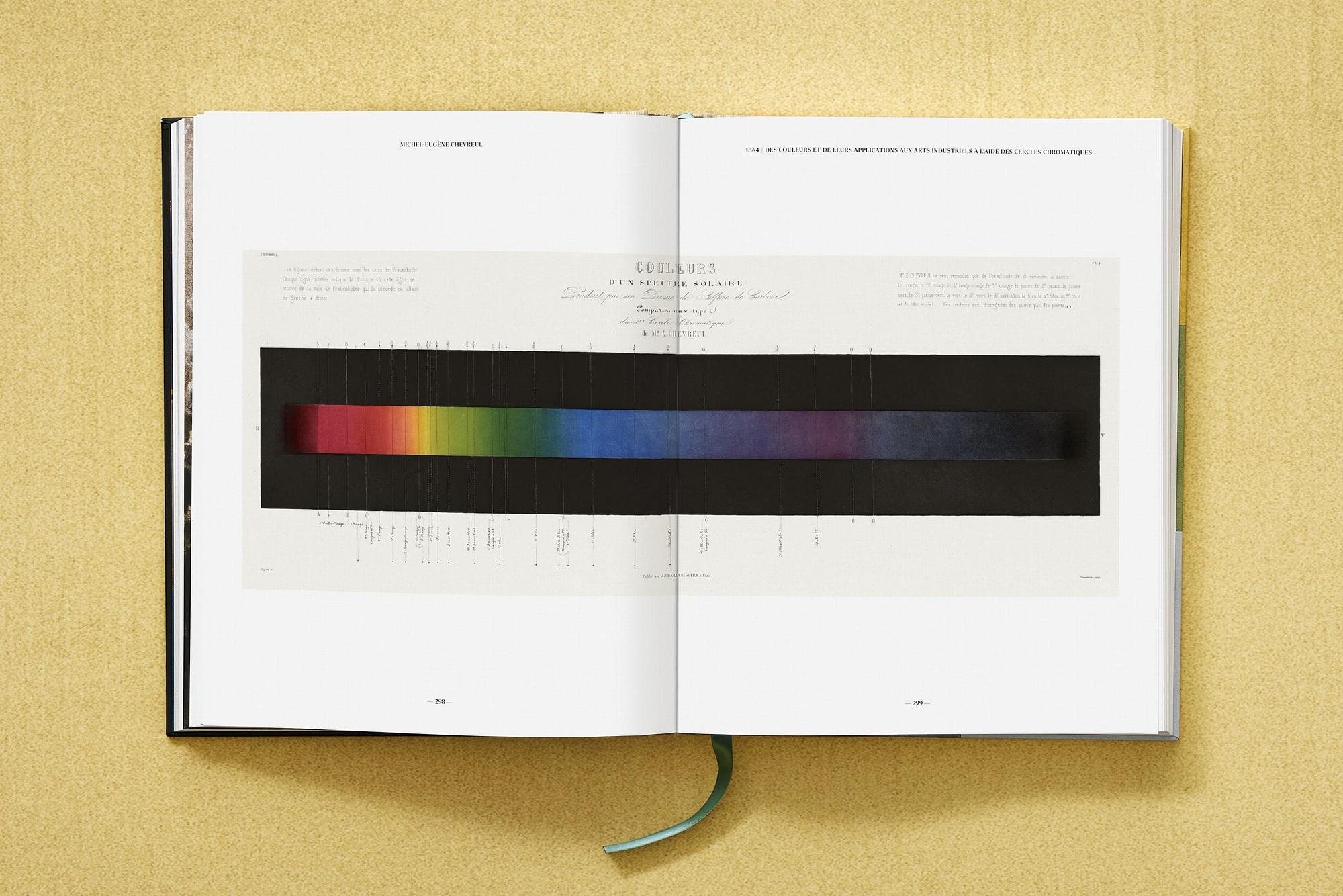
About the book: From the 17th century to the dawn of the digital age, color theories were illustrated with colored circles and elaborate diagrams. With more than 65 works from around the world and over 1,000 illustrations, this book illuminates the many facets of a topic that inspired Newton, Goethe, Sanz? Wada, the Bauhaus, and many others.
Biography: Sarah Lowengard is a historian of technology and science who writes about practical and philosophical engagements with color. For over forty years, she has restored artworks and has been making handcrafted pigments even longer. Lowengard is a member of the faculty of Humanities and Social Sciences at Cooper Union in New York and maintains connections with various organizations for the history of technical art and art analysis in the USA and beyond.
Alexandra Loske is a British-German art historian, author, and museum curator with a particular interest in the role of women in the history of color. She received her doctorate from the University of Sussex and is currently the Curator of the Royal Pavilion in Brighton. In addition to numerous lectures and publications on color and other topics, Loske has curated a number of exhibitions, including "Regency Colour and Beyond, 1785–1845" at the Royal Pavilion in 2014.
Pages: 846
CO AUTHOR
EDITOR: Lowengard, Sarah
Loske, Alexandra
First publication: 12/03/2024
Book language: Multilingual (English, French, German, Spanish)
Edition: INT
ISBN: 978-3-8365-9565-0
Themes: Classics
Dimensions: 24.3 cm x 30.4 cm, Weight 5.95 kg
Der TASCHEN Verlag zählt zu den renommiertesten Kunst- und Bildbandverlagen weltweit. Mit einem vielfältigen Programm von Kunst, Fotografie, Design, Architektur, Mode, Film und Popkultur bis hin zu Sammlerwerken steht TASCHEN seit Jahrzehnten für höchste Qualität und außergewöhnliche Gestaltung. Gemeinsam mit COCOLI bietet der Verlag nun eine Auswahl an Coffee Table Büchern mit kleinen Schönheitsfehlern an, die Kunst- und Designliebhabern nachhaltigen Zugang zu inspirierenden Werken ermöglicht.
- Manufacturer TASCHEN
- Material Paper
- Color White
- Scope of Delivery 1 Product
- Style Art Nouveau
- Article Number 978-3-8365-9565-0
- Dimensions W 24cm x D 1cm x H 30cm
- Sold by Official Brand Dealer
- Listed on 22.09.2025
- Product Safety Show Manufacturer Details
- Item Condition Display piece, B-stock or return from a retailer
- Signs of Wear Good Condition
-
Description of Condition
Exclusive collaboration between TASCHEN and COCOLI
These coffee table books come from the Berlin showroom of the renowned TASCHEN publishing house. As display items, they may show minor signs of wear, such as creased or slightly damaged covers. Together with our customers, we give these "imperfect" books a second life – a contribution to real sustainability.
- Parcel Delivery Shipping is done by COCOLI via recognized carriers such as UPS and DPD. Only products that can be safely packaged in a box are shipped by parcel. Items are usually delivered within 2 weeks of the purchase date.
This item comes from a retailer's inventory. The statutory right of withdrawal applies.
Similar Items

William Claxton. Jazzlife Multilingual
Vermeer. The complete works in English
The Fantastic Worlds of Frank Frazetta (FFE)

The Fantastic Worlds of Frank Frazetta
The Art and Science of Ernst Haeckel
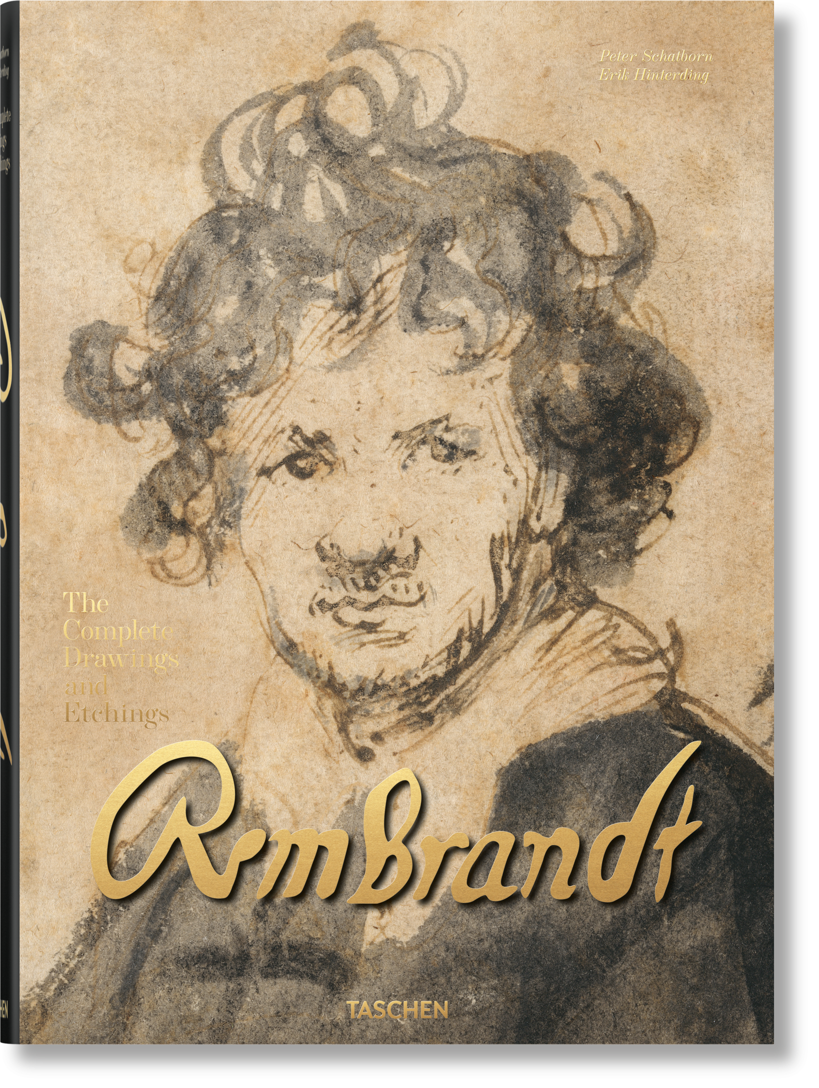
Rembrandt. The Complete Drawings and Etchings
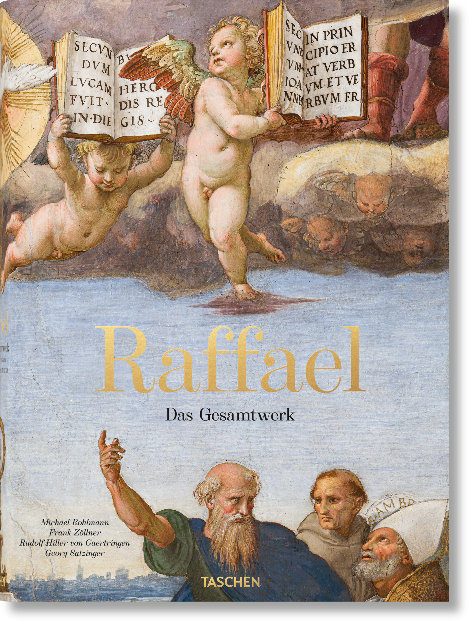
Raffael. The Complete Works. Paintings, Frescoes, Tapestries,...
The Star Wars Archive. 1999–2005
Christo and Jeanne-Claude. Updated Edition